To create a new business, not only an idea is needed. In truth, several are needed. Especially, considering that at the beginning decisions must be made that will guide the activity of that brand throughout the years.
It is at that moment when strategic issues are defined that will create the digital footprint of that company.
Absolutely everything is important: from the target or audience to which the product or service is directed, the form of commercialization and its competitive advantages, to its values and the message it wants to transmit to the public.
All this forms a identity, a specific brand on which the visual proposal is based.
In previous posts, we talked about the development of corporate identity, the first step to consider when creating a brand.
The “personality” of each brand is reflected in a visual proposal that transmits sensations, emotions, philosophy, and values through the different elements that make up the image.
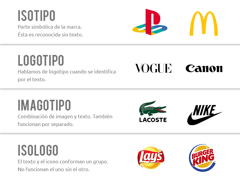
Initially, it is necessary to define a logo, which can be composed of icons or texts, or the sum of both. This is how you will have a logotype (typography only), an isotype (icon only), or an isologotype (composed of graphic and textual parts in an indivisible way).
The logo, source of all identity visual
When it comes to associating the brand name with a visual design (logo), some strategic issues must be taken into account since the logo will be present in every piece developed in the future.
Typography
Both its font and contrast must be legible in small sizes, not just on large surfaces. This is fundamental when planning campaigns or social media presence, where in a reduced space, the logo must generate quick identification.
It is very interesting to analyze the case of Zara's logo redesign. In 2019, they changed the typography, moving away from minimalism and proposing a logo that was heavily criticized in the design world, precisely because it generated little comprehension. The new font was presented with serifs (finials that adorn the main features of each letter) that overlap with those of the adjacent letter and little space between each of them, presenting serious “kerning” problems (the process of adding or removing space between characters).
Color
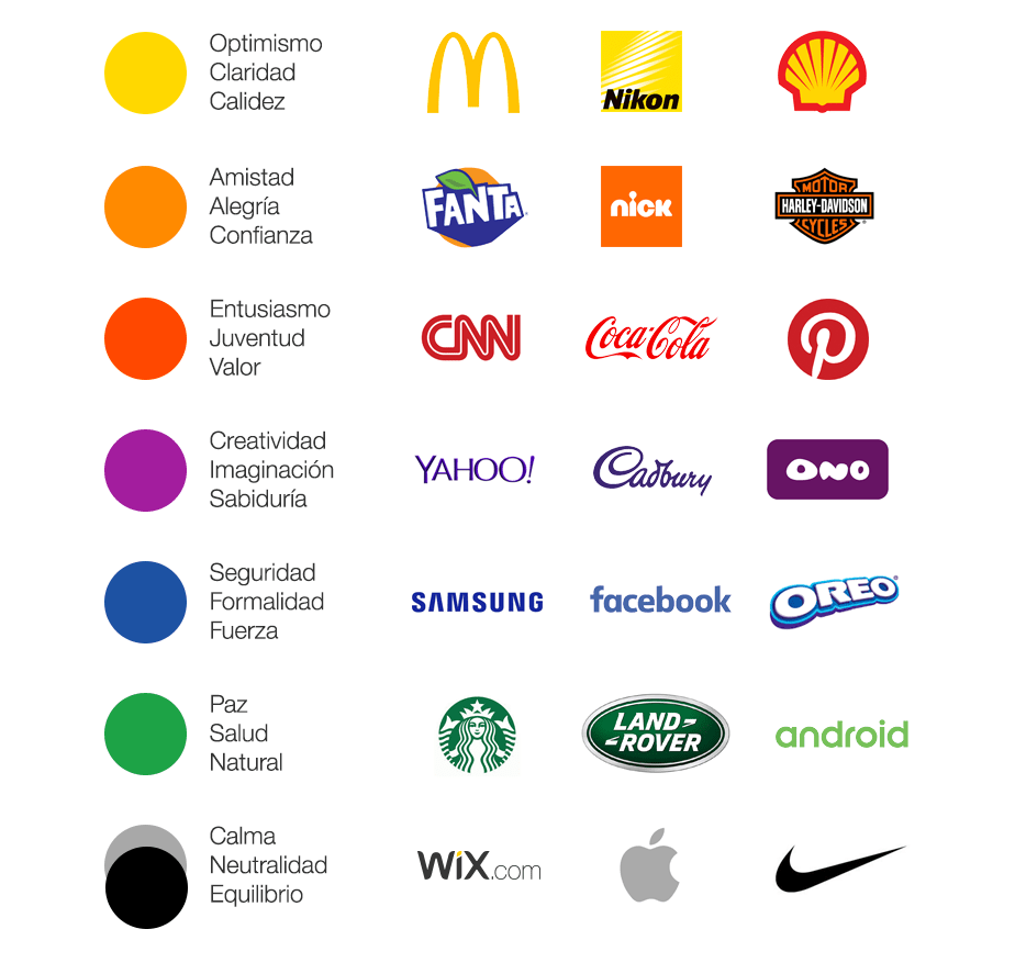
The logo will be used on different backgrounds, so it is important to generate color options so that it does not lose impact. At this point, it is interesting to reflect on the psychology of color. Indeed, each color is associated with an emotion, and since what is sought in every advertising message is always to move, it is not a topic to be overlooked.
Simplicity and definition
Unlike what happened with logos created two or three decades ago, new logos have to be redesigned or created taking into account a “responsive” use, adaptable to different formats. The simplicity and synthesis of the design are attributes that will allow the logo to stand out properly in different formats.
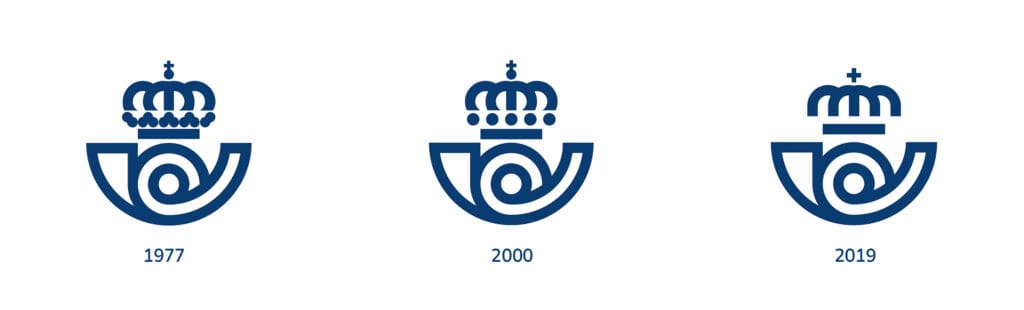
A clear example of this is the redesign of the Spanish postal service logo. It was created in 1977 by the designer, painter, and sculptor José María Cruz Novillo. Clearly, it needed a new image that would facilitate the logo's accompaniment in all the new services currently provided by the postal service. The new study removed the five dots that appeared below the crown, left more space between all the elements, changed the cross at the top, and removed the name Correos, further simplifying the design.
Icons
Depending on the nature of the activity, it is not always possible to resort to the use of a graphic visual symbol that synthesizes the brand's product or service. But when this is feasible, a greater impact on communication is achieved.
At Grupo Vansur, for example, we designed the corporate image for an online store. In the icon of its logo, we synthesized the act of buying with the characteristic of being online, by including a bag and a mouse. Along with that, as seen in the image, we highlighted the company name. In this way, the isologo is composed of the sum of the icon plus the text.
Shape
There is much literature on the perception of shapes and the brain mechanism that is activated to remember some over others. They are also associated with the message one seeks to convey. For example, curved lines convey elegance, circles represent cooperation and stability, squares and rectangles are often seen as a sign of security and trust.
Regardless of each association, it is important to keep in mind that every part that makes up the logo must contribute to the unique message the brand seeks to convey. Everything must cooperate in the same direction.
Similarly, the brand's visual identity must function as a whole. Font, color palette, style, and content must be encoded under a single message: to enhance the brand's personality and philosophy, what makes them unforgettable and desire-generating.